How to Create a Full-Screen Preloader Without Any Library

Introduction
As we get to create more and more complex, modern, and high-speed websites and web apps, we as website visitors can't wait for a webpage to load for more than 4 seconds.
There is a separate debate on how fast should a website load, but thankfully designers and developers came together way back to find a bit of a middle road to fix the issue of not allowing the website visitor to skip or close the website window, but instead allowing them to wait for a couple of seconds until the entire webpage or a specific section loads.
In this CSS tutorial, we will be tackling this issue getting to know how to create a loader element that scales the full-screen of the webpage until the content behind it loads perfectly. And yes, it will only be using the barebones of the web i.e. HTML, CSS, and just a tiny bit of JavaScript.
What is a preloader?
Essentially, preloaders or simply 'loaders' are just some element(s) you see on the screen while the rest of the page's content is still loading.
The content that's loading can be both dynamic or static. However, preloaders/loaders are often seen on web apps where you might be shown a loading screen until your payment is processed. Check out the following image for reference:

They can come in all shapes and sizes and usually are created by a designer or a mico-interaction enthusiast from where it's the job of a front-end developer like us to implement it on our webpage.
On a website, CSS preloaders are important interface elements that let visitors know that the website hasn't crashed, it's just processing data.
How to make a full-screen preloader?
Now there's a slight difference between a normal loader/preloader and a full-screen preloader. Usually, these cover the entire width of the webpage and the actual loading animation is present at the center. They can be as simple as this infinity preloader:

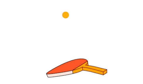
Or ridiculously creative like this one for a ping-pong sports website:
But in our case, we will be making a breathing circle like preloader work as shown in the demo below:

As you can see here, first the preloader animates for a few seconds and when the content behind it is ready to load or show up, it goes away and we can now use the website.
A simple concept behind making such a preloader without any external libraries are these three steps:
1. We use the SVGs to get the actual loading animation working. It will be a spinner element that animates over a period of time. SVGs are scalable and implementing them is relatively easy.
2. We use CSS to add the styling of our preloader so that it sits perfectly at the center of our webpage no matter what viewport or size the browser window is.
3. We then use a bit of JavaScript code to hide the preloader and show the content behind it.
Let's start with the markup
We first start with the actual content to show after the preloader stops. For that, we have the following HTML markup:
<div class="wrapper">
    <h1> Live video transcription</h1>
    <p>Lorem, ipsum dolor sit amet consectetur adipisicing elit. Fugit necessitatibus, quod perspiciatis voluptatem veroece natus dolores eaque, consequatur perferendis sint ex, corrupti rerum.</p>
    <a href="#">Get started →</a>
</div>
As for the actual preloader markup, we need a preloader wrapper class that
contains our GIF image. This will help us in positioning the preloader on the page
perfectly as we need. Don't forget to put the alt tag for
accessibility:
<div class="preloader">
  <img src="https://link-to-image.gif" alt="spinner">
</div>
Make sure you put this code above the content code so that our HTML file contains the following:
<div class="preloader">
  <img src="https://link-to-image.gif" alt="spinner">
</div>

<div class="wrapper">
    <h1> Live video transcription</h1>
    <p>Lorem, ipsum dolor sit amet consectetur adipisicing elit. Fugit necessitatibus, quod perspiciatis voluptatem veroece natus dolores eaque, consequatur perferendis sint ex, corrupti rerum.</p>
    <a href="#">Get started →</a>
</div>
Styling with CSS
You can style the content you want to show after the preloader stops to your liking. For this demo, we will skip to the styling of the preloader wrapper instead. This will be your CSS code for the preloader:
.preloader {
  align-items: center;
  background: #FFF;
  display: flex;
  height: 100vh;
  justify-content: center;
  left: 0;
  position: fixed;
  top: 0;
  transition: opacity 0.2s linear;
  width: 100%;
  z-index: 9999;
  opacity: 1;
  transform: opacity 1s linear;
}
-
Here, we use
CSS Flexbox
to display the preloader wrapper directly in the center of the screen with the
align-itemsandjustify-contentproperties.
-
With properties like
height: 100vhandwidth: 100%we make sure that this element takes up the entire height and width of the current viewport.
- Notice that we have given it a white background, so that it matches up the webpage's actual background color. Along with this, making it of fixed position is crucial because with that if we scroll it won't affect the loader's location on the page.
-
The high
z-indexthen ensures that no other element would stack on top of our preloader element blocking it from the view.
- Finally, we can add a bit of transition and transforms on the opacity so that the process of fading in and out can be achieved for a better user experience.
Adding a bit of JavaScript magic
Let's say you don't like the current fading in and out transitions and you want to manually control the amount of time it takes for this animation.
For that, open up the JavaScript file of the current project, and let's first grab the
.preloader element:
const myPreloader = document.querySelector('.preloader');
Now we will create a custom fadeOutEffect function which is wrapped in
setInterval()
timeout method. We check the opacity property every
300 milliseconds to see if it's greater than 0. If it is, then
we decrease its value in 0.1 increments. This accounts for a smooth
transition effect.
Once it hits the 0 opacity value, we
clearInterval()
to stop it from running indefinitely. Here's how it looks like in code:
const fadeOutEffect = setInterval(() => {
  if (!preloader.style.opacity) {
    preloader.style.opacity = 1;
  }
  if (preloader.style.opacity > 0) {
    preloader.style.opacity -= 0.1;
  } else {
    clearInterval(fadeEffect);
  }
}, 300);
Don't forget to call this function on the page load:
window.addEventListener('load', fadeOutEffect);
Conclusion
And with that, you got to know how to make a loader without using any CSS or JavaScript library! The main thing to note here is how CSS code is used to center the preloader and how we made it full-screen for any viewport. Also with JavaScript, we took it a step further and manually controlled the entire fade-out transition!
From here, you can refer to the following resources to better understand this topic:
- Preloaders on Tumblr
- How to Create Custom Loading Animations to Decrease Bounce Rates
- Create your own animated loaders
--
If you want to stay up to date with all the new content we publish on our blog, share your email and hit the subscribe button.
Also, feel free to browse through the other sections of the blog where you can find many other amazing articles on: Programming, IT, Outsourcing, and even Management.


With over +16 years of experience in the technology and software industry and +12 of those years at Jobsity, Santi has performed a variety of roles including UX/UI web designer, senior front-end developer, technical project manager, and account manager. Wearing all of these hats has provided him with a wide range of expertise and the ability to manage teams, create solutions, and understand industry needs. At present, he runs the Operations Department at Jobsity, creating a high-level strategy for the company's success and leading a team of more than 400 professionals in their work on major projects.