How to Make Dark Mode for Websites Using Only CSS

Ever since it became trendy, the demand for websites, web apps, desktop software, and tools to have dark theme support is ever increasing.
Nowadays, every other website needs a dark theme, and while there are tonnes of methods to implement a new theme, one of the most interesting and less time-consuming ways for developers is to just use the power of CSS to deliver a website with dark theme support.
In this CSS-only dark mode tutorial, you will get a short introduction to variables in CSS and then you will create a super simple yet CSS-only dark theme implementation of a website section.
A short intro to CSS variables
Before we start with the dark theme implementation, we need to dive into the world of CSS variables and advanced selectors.
What are CSS variables?
CSS custom properties, or commonly known as CSS variables, are some rulesets that contain specific values to be reused throughout a document.
Just like you create variables in any other programming language, like JavaScript, so that we can use variable’s value throughout the program, in styling with CSS with large websites, we get large amounts of repeated values which we can condense into a specific set of CSS variables to inject them on the properties throughout the styling of the app wherever needed.
Let’s look at an example. If your webpage has an accent color that you know will be used in primary buttons, links, and borders of images, then instead of doing this:
.primary-btn {
  color: #88d95f;
}

img {
  border: 2px dashed #88d95f;
}

.links {
  color: #88d95f;
}
.
.
.
We can create a variable called --accent-color and give it a value of the hex code “#88d95f”. Now, we can add this new custom variable to the :root pseudo-class so that it can be accessed globally:
:root {
  --accent-color: #88d95f;
}
Now, the above code changes to this:
.primary-btn {
  color: var(--accent-color);
}

img {
  border: 2px dashed var(--accent-color);
}

.links {
  color: var(--accent-color);
}
.
.
.
One of the greatest use cases of this is that whenever we need to change the color value, we can simply change it at one place at the :root selector declaration and the result will be affected on all the elements where it was used!
Let’s create dark theme with just CSS
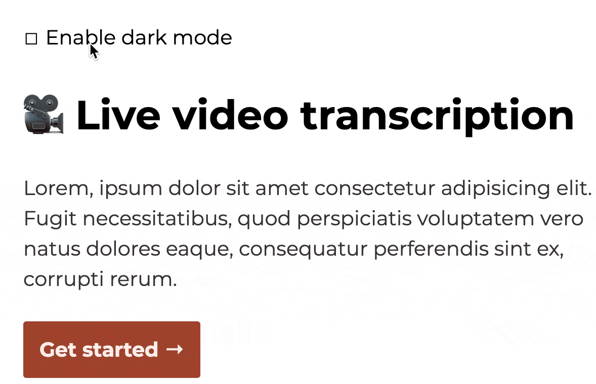
We will be using the recently gained knowledge of CSS variables to build a dead-simple but very effective section of a webpage. Here’s what it looks like in default or light mode:
-png.png)
And here’s what it looks like in dark theme:
-png.png)
As you can see we have the following four elements here:
- The checkbox to enable dark theme.
- The heading.
- The paragraph.
- The button (or effectively, a link).
Everything will be made with the help of CSS only and no JavaScript will be involved in this. When we click on the “Enable dark theme” checkbox, the entire webpage section should turn to the dark theme. Let’s see how to do this step by step.
Creating the HTML structure
- Here we start with the
<input />tag which will be of typecheckboxand we give it two classes:dark-mode-checkboxandhidden.
- After this, we need to have a container around the label for our checkbox which we give a class of
checkbox-containerthat will contain thedark-mode-label. Don’t forget to add theidofdark-modeto the<input />tag so that<label>also gets the samefor attribute.
- As for the actual content like the text and the button link, we make a new
divfor it with thewrapperclass. Under this, make sure you have the heading, paragraph, and anchor tags.
If you follow all the above steps, we get the following HTML code:
<input id="dark-mode" class="dark-mode-checkbox hidden" type="checkbox">

<div class="checkbox-container">
  <label class="dark-mode-label" for="dark-mode">
    Enable dark mode
  </label>


  <div class="wrapper">
    <h1>🎥 Live video transcription</h1>
    <p>Lorem, ipsum dolor sit amet consectetur adipisicing elit. Fugit necessitatibus, quod perspiciatis voluptatem vero natus dolores eaque, consequatur perferendis sint ex, corrupti rerum.</p>
    <a href="#">Get started →</a>
  </div>
</div>
And on your browser it will result in this:
-png.png)
We have a lot to do here from now: the basic styling and then actually making the checkbox toggle work for dark theme.
Adding basic CSS styles
Let’s switch to the CSS file and import the custom Montserrat font from Google Fonts:
@import url('https://fonts.googleapis.com/css2?family=Montserrat:wght@400;600;700&display=swap');
Now, let’s add the new font to our body tag and make it a flexbox so that our container fits perfectly on any viewport. We can also reset the margin, font-size, and line-height as required:
body {
  font-family: 'Montserrat', sans-serif;
  display: flex;
  flex-direction: column;
  margin: 0;
  font-size: 1.25em;
  line-height: 1.5;
}
We also make the usual adjustments to h1, .wrapper, p, and a tags without touching on the background and color properties as shown:
h1 {
  margin-top: 2rem;
}

.wrapper {
  max-width: 600px;
  text-align: left;
}

p {
  margin-bottom: 2.5rem;
}

a {
  text-decoration: none;
  padding: 1rem;
  border-radius: 3px;
  font-weight: bold;
}
For the checkbox itself, we can use the .hidden class to hide the default checkbox rendered by the browser. Now, we need to replace the original checkbox with the ::before pseudo-class to use the 2610 and 2611 hexadecimal Unicodes for the tick and untick. Along with this, we give some padding to the .checkbox-container:
.hidden {
  display: none;
}

.dark-mode-label::before {
  content: "2610";
}

.dark-mode-checkbox:checked ~ .checkbox-container .dark-mode-label::before {
  content: "2611";
}

.checkbox-container {
  padding: 1.5rem;
 }
Implement dark theme
For this, we first need to define all the custom variables used for the foreground and background colors needed in our elements.
- We first define the hex color variables for light theme and then the dark theme at the
:rootas:
  :root {
    /* Light mode variables */
    --container-background: #FDF8F7;
    --para-light-text: #333333;
    --anchor-light-text: #FAEEEB;
    --anchor-light-bg: #A04229;
    /* Dark theme variables */
    --container-dark-text: #FDF8F7;
    --container-dark-background: #1C0C07;
    --para-dark-text: #CCCCCC;
    --anchor-dark-text: #512115;
    --anchor-dark-bg: #F5DDD6
  }
- Next, we select the .
checkbox-containerelement that are siblings of.dark-mode-checkbox:checkedclass which will match the selected checkbox state of the element. This is done by the ~ sibling selector as:
.dark-mode-checkbox:checked ~ .checkbox-container
All the rules we set in this CSS block will act as a toggle logic of the theme from light to dark theme and vice-versa. When the checkbox is in the selected mode it will toggle the theme and when unchecked it goes back to its base styles.
  .dark-mode-checkbox:checked ~ .checkbox-container {
    --container-text: var(--container-dark-text);
    --container-background: var(--container-dark-background);
    --para-light-text: var(--para-dark-text);
    --anchor-light-bg: var(--anchor-dark-bg);
    --anchor-light-text: var(--anchor-dark-text);
  }
Basically, all we are doing here is setting the default light color theme value to the new dark theme colors for both the text and the background.
--container-text: var(--container-dark-text);
The line above translates to: “Change the --container-text color value to the new --container-dark-textwhen the checkbox is selected (or deselected).”
- With this, we can now fill up the colors and background values whenever needed:
  .checkbox-container {
   // Previous styles
    color: var(--container-text);
    background-color: var(--container-background);
  }
  p {
    // Previous styles
    color: var(--para-light-text);
  }
  a {
   // Previous styles
    color: var(--anchor-light-text);
    background: var(--anchor-light-bg);
  }
With this, you get the following CSS code:
  @import url(https://fonts.googleapis.com/css2?family=Montserrat:wght@400;600;700&display=swap);
  :root {
    /* Light mode variables */
    --container-background: #FDF8F7;
    --para-light-text: #333333;
    --anchor-light-text: #FAEEEB;
    --anchor-light-bg: #A04229;
    /* Dark theme variables */
    --container-dark-text: #FDF8F7;
    --container-dark-background: #1C0C07;
    --para-dark-text: #CCCCCC;
    --anchor-dark-text: #512115;
    --anchor-dark-bg: #F5DDD6;
  }
  .dark-mode-checkbox:checked ~ .checkbox-container {
    /* Toggle the theme */
    --container-text: var(--container-dark-text);
    --container-background: var(--container-dark-background);
    --para-light-text: var(--para-dark-text);
    --anchor-light-bg: var(--anchor-dark-bg);
    --anchor-light-text: var(--anchor-dark-text);
  }
  body {
    font-family: 'Montserrat',sans-serif;
    display: flex;
    flex-direction: column;
    margin: 0;
    font-size: 1.25em;
    line-height: 1.5;
  }
  .checkbox-container {
    padding: 1.5rem;
    color: var(--container-text);
    background-color: var(--container-background);
  }
  /*
  * Replace original checkbox
  */
  .dark-mode-label::before {
    content: "2610";
  }
  .dark-mode-checkbox:checked ~ .checkbox-container .dark-mode-label::before {
    content: "2611";
  }
  /* To hide the default checkbox */
  .hidden {
    display: none;
  }
  h1 {
    margin-top: 2rem;
  }
  .wrapper {
   max-width: 600px;`
   text-align: left;
  }
  p {
    margin-bottom: 2.5rem;
    color: var(--para-light-text);
  }
  a {
    text-decoration: none;
    color: var(--anchor-light-text);
    background: var(--anchor-light-bg);
    padding: 1rem;
    border-radius: 3px;
    font-weight: bold;
  }
And now you get the fully working dark theme with just CSS!
Conclusion
In this CSS dark mode tutorial, we got to know how to make a dark theme for your webpage using only CSS. Particularly, we talked about CSS variables which come really handy in such a process. We then implemented it in a short demo where we used some pseudo-classes and advanced CSS selectors to make a toggle for the light to the dark theme.
From here, you can refer to the following resources to better understand this topic:
- Pure CSS3 Dark Mode Effects for Website
- CSS :checked pseudo-class selector
- A Complete Guide to Dark Mode on the Web
--
If you want to stay up to date with all the new content we publish on our blog, share your email and hit the subscribe button.
Also, feel free to browse through the other sections of the blog where you can find many other amazing articles on: Programming, IT, Outsourcing, and even Management.


Santiago Mino, VP of Strategy at Jobsity, has been working in Business Development for several years now helping companies and institutions achieve their goals. He holds a degree in Industrial Design, with an extensive and diverse background. Now he spearheads the sales department for Jobsity in the Greater Denver Area.